Getting more people to send money home.
The money transfer screen was the app's front door — and its biggest leak. I rebuilt it, and made it the #1 way people start a transfer.
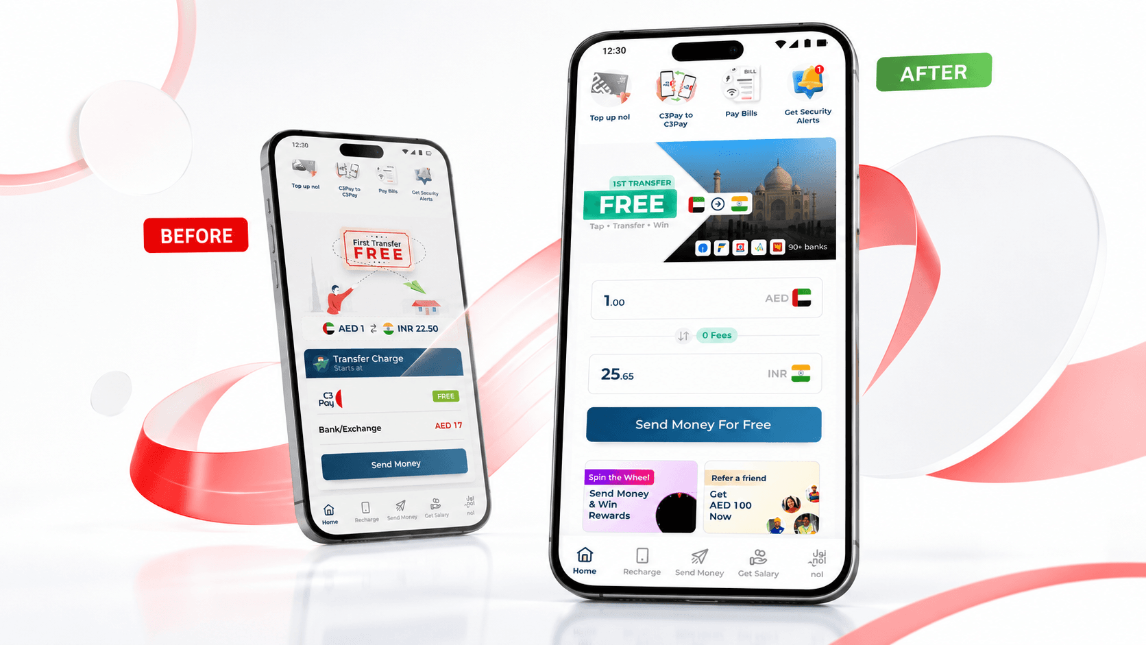
C3Pay is a salary card and app by Edenred, used by 2.8 million blue-collar workers across the UAE — construction workers, drivers, cleaners, delivery riders.
For most of them, this card is their only bank account. They get paid on it, and they use it to send money home to their families in India, Pakistan, Bangladesh, Nepal, the Philippines, and Sri Lanka.
That last part — money transfer — is the most important, most emotional thing the app does. And it's what this case study is about.
Get more people who open the money transfer screen to actually send.
The target for the year was to grow money transfer usage from 14.1% to 14.5%. My job: turn the dashboard card — the biggest thing on screen — into a real entry point. Before touching pixels, I went to the data.
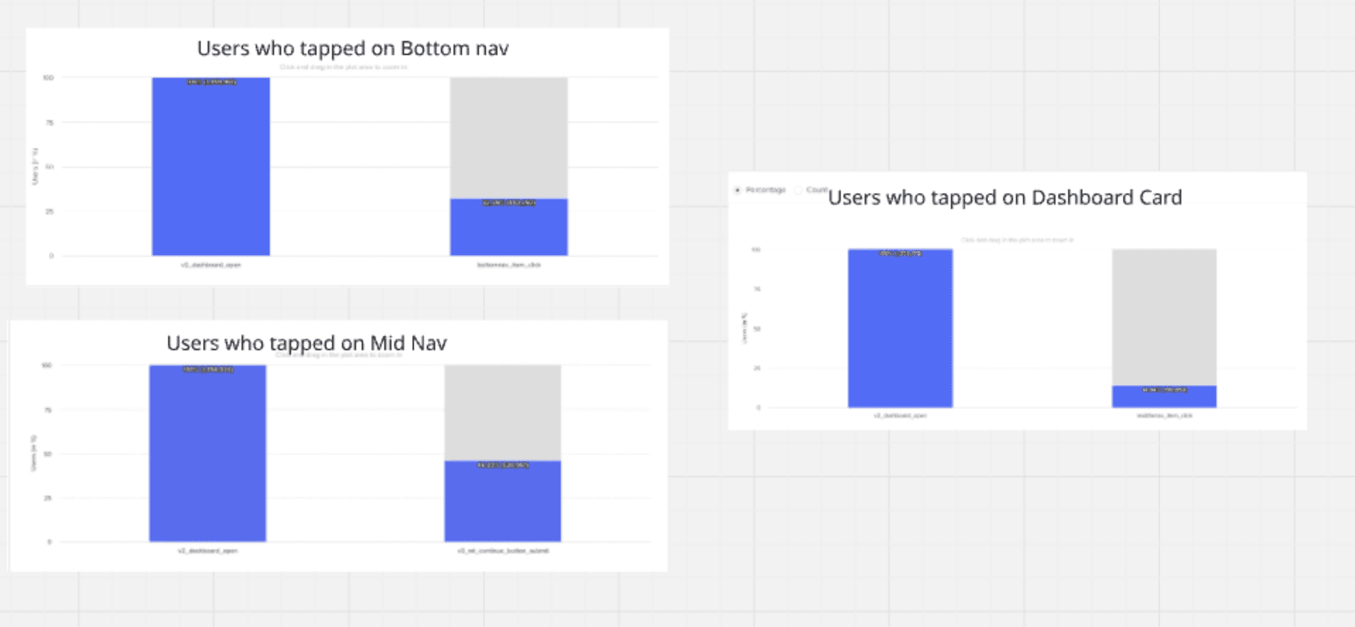
The numbers pointed straight at the first tap.
Of everyone who opened the money transfer screen, fewer than half carried on to send.
There were three ways into money transfer — and the dashboard card, the biggest thing on screen, was the least used of all three.
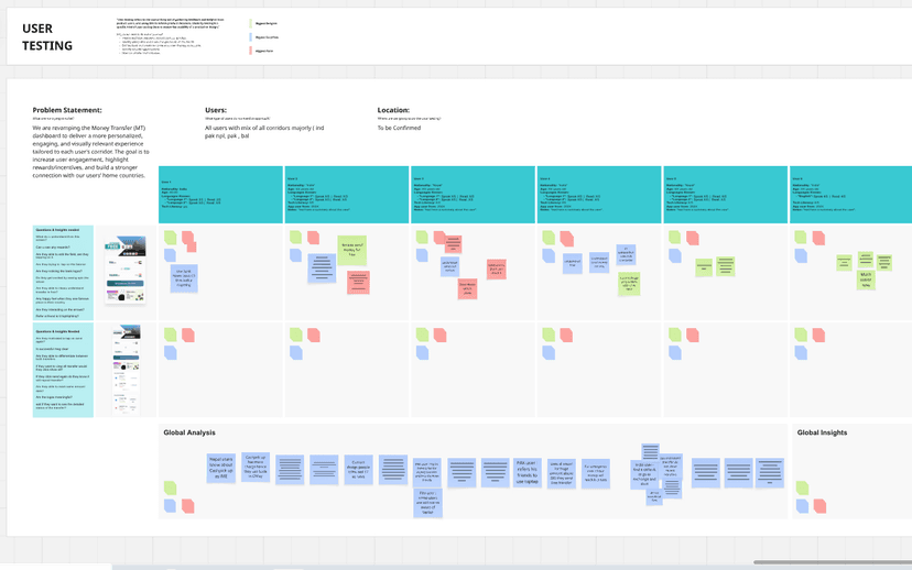
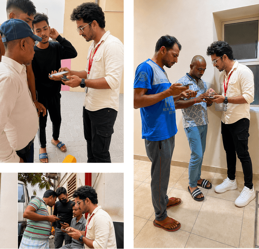
So I watched 8 real users use the old screen.
Users from India, Pakistan, and Nepal — basic English, low-end phones. The data showed where people dropped. Watching them showed why.
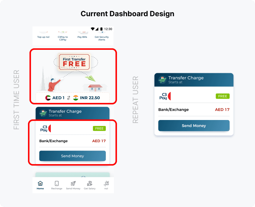
The AED 17 was meant to say "we're cheaper." Users thought we were charging it.
— From problem-discovery testing · 8 users
They also struggled with mixed fee messages, and — for returning users — a screen so bare there was no reason to come back.
Three problems, found — not assumed.
I didn't start with a problem statement. I found it by following the data and watching users.
New users saw mixed messages — "free" here, a charge there.
An "AED 17" comparison meant to show we're cheaper — but people thought we were charging it.
Returning users got just a box and a button. No reason to come back.
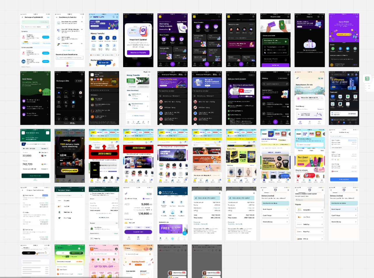
I looked at what already works — and who I'm designing for.
I studied apps our users already love — remittance apps (TapTap, IME) and delivery apps.
One card can't talk to everyone. So I grouped users by how active they are and which country they send to.
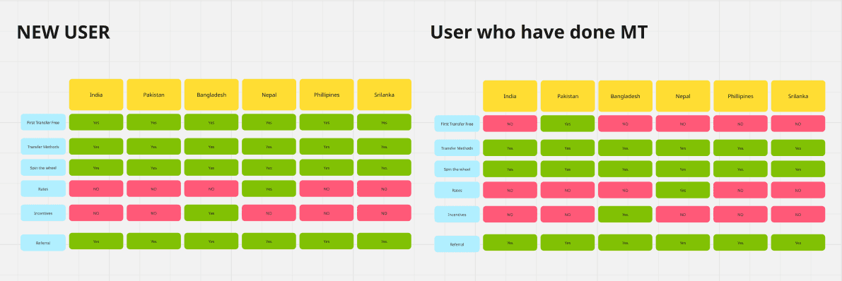
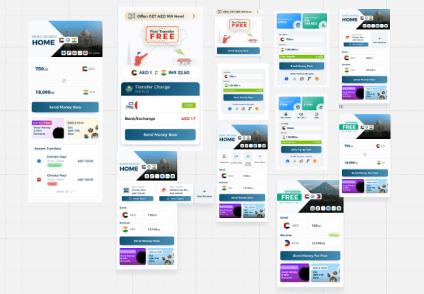
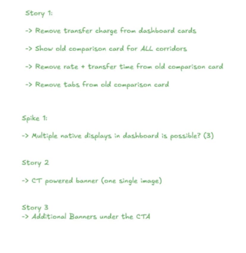
I built it in four phases, not one big leap.
A screen this important is risky to change all at once. So I shipped it piece by piece.
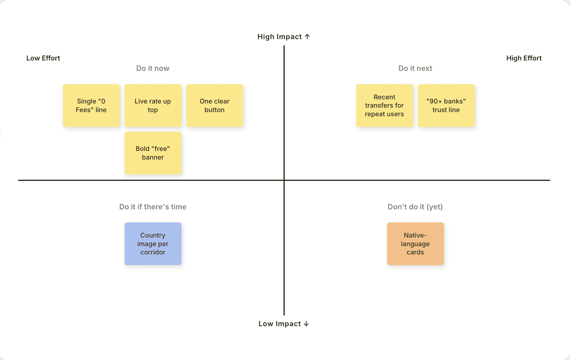
The hard call
Most heartfelt — greet a Hindi sender in Hindi. But India alone has many languages. High effort, unclear payoff.
Clear rate, 0 fees, one button. Save the language idea for later.
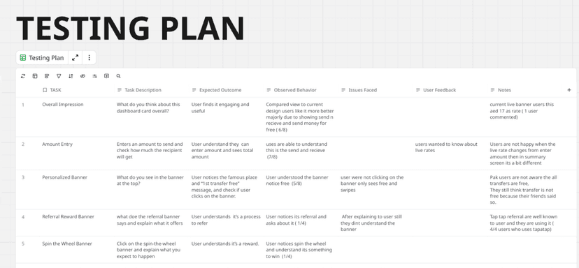
Before shipping, I tested the finished design.
A second round — 10 users across India, Pakistan, and Nepal — this time on the new design, to check it actually worked.
- "Much easier now." Cleaner, faster to read.
- Understood "free" right away.
- Fee confusion gone — no one thought we were charging them.
- Noticed the rewards below.
- Referral felt complex.
- Wanted recent transfers.
One clear screen. One clear number.
No more scary comparison.
The number people came for.
Impossible to miss.
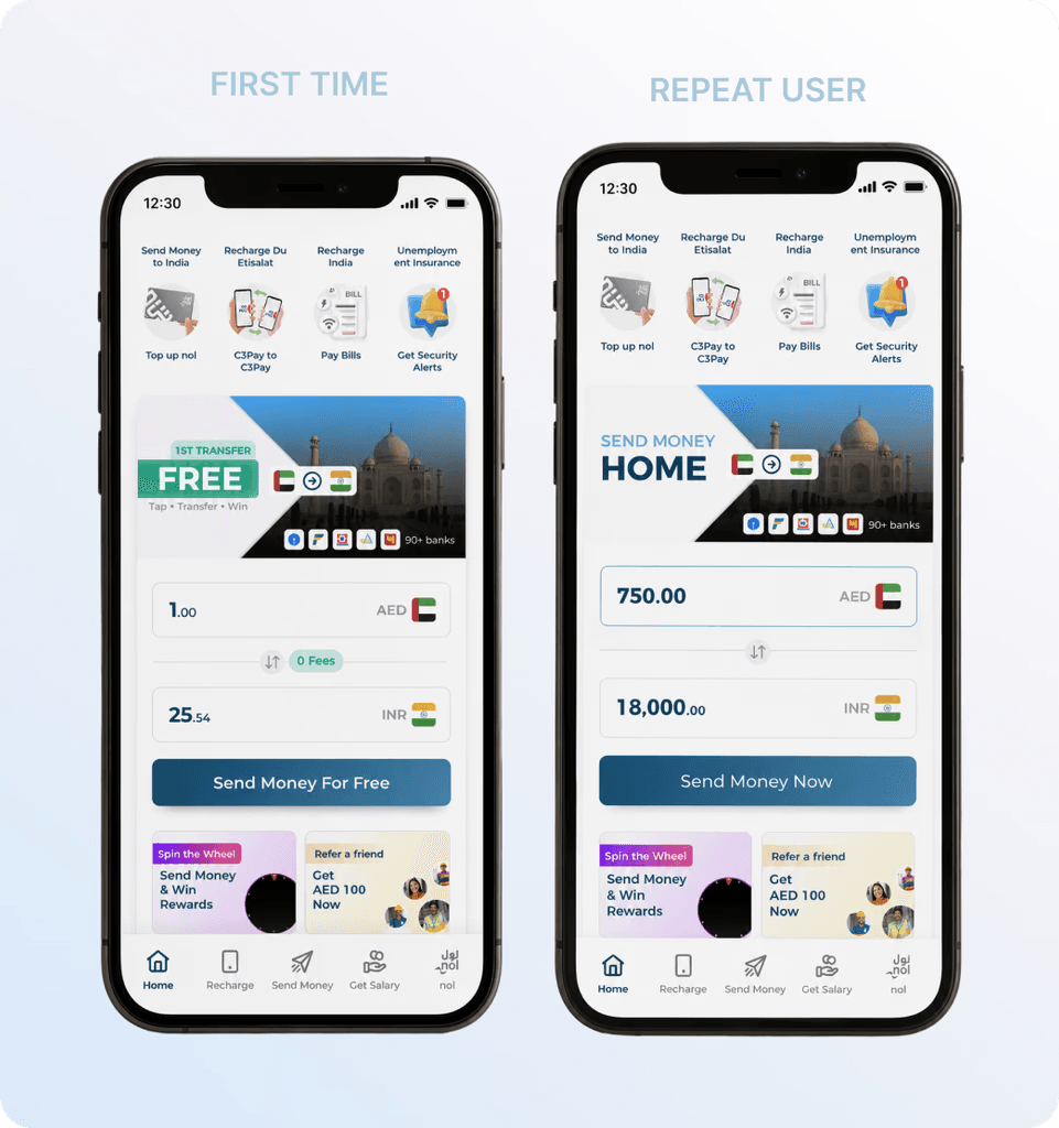
Answers "is my money safe?"
Recent transfers for regulars.
Marketing swaps it, no dev time.
The dashboard card went from the worst way into money transfer to the best.
Before, it was the least-used of three entry points. After the redesign, it became the single highest-performing touchpoint in the app.
And I didn't stop there.
A 30-minute AI-made GIF test added another +3% in Pakistan. A quick input fix lifted Bangladesh from 12% to 17%. Small bets, real gains.
The headline +5.2% is from the full release — the new card and the live-rate / 0-fees view shipping together. These are separate wins on top.